Interactive UI/UX Laws Guide

Learn the fundamental principles of user interface design

We'll analyze websites using these ten fundamental UX laws. The additional laws below provide supplementary context for comprehensive UX understanding.

Core UX Laws for Website Analysis

Fitts' Law

Interaction

Developed in the 1950s by psychologist Paul Fitts, this law establishes that the time required to reach a target depends on the distance to travel and the target's size. This logarithmic relationship is fundamental in graphical interface design.

Concrete Applications

In interface design, this law translates into several practical principles:

  • Important action buttons must be sufficiently large
  • Frequently used elements should be easily accessible
  • Dropdown menus need generous click areas
  • Screen corners are prime locations as they're infinitely large in targeting terms

Ergonomic Considerations

Implementing Fitts' Law must account for:

  • Various pointing devices (mouse, touch, etc.)
  • Accessibility for users with motor impairments
  • Balance between available space and element size

Hick's Law

Decision Making

Hick's Law, discovered by psychologists William Edmund Hick and Ray Hyman in 1952, states that the time required to make a decision increases as the number and complexity of choices increase. This relationship is logarithmic, similar to Fitts' Law.

Design Implementation

To optimize decision-making time, designers should:

  • Break complex tasks into smaller, manageable steps
  • Group similar options together
  • Use progressive disclosure for complex interfaces
  • Prioritize and highlight commonly used options

Real-world Examples

Effective applications include:

  • Progressive form completion in e-commerce checkouts
  • Categorized menu systems in applications
  • Filtered search results to reduce options
  • Smart defaults in configuration settings

Jakob's Law

Familiarity

Jakob's Law, established by Jakob Nielsen, states that users spend most of their time on other websites. Therefore, they prefer your site to work similarly to others they already know. This principle fundamentally shapes how we approach familiar design patterns.

Practical Application

This law directly influences UI design by favoring familiar interaction patterns. Users can thus focus on content rather than learning a new interface. Key implementations include:

  • Logo placement in top-left corner linking to homepage
  • Main navigation menu at the top of the page
  • Shopping cart in top-right corner
  • Search form in the header

User Experience Impact

Applying this law helps:

  • Reduce cognitive load on users
  • Build trust through familiarity
  • Improve navigation efficiency
  • Decrease bounce rates

Miller's Law

Cognition

George Miller demonstrated in 1956 that human working memory can hold approximately 7 (±2) items simultaneously. This fundamental discovery profoundly influences how we structure information in interfaces and design navigation systems.

Design Impact

This cognitive limitation requires specific presentation strategies:

  • Grouping information into meaningful chunks
  • Limiting menu options to manageable numbers
  • Creating clear information hierarchies
  • Implementing pagination or infinite scroll

Chunking (grouping) effectively circumvents this limitation by creating larger but coherent information units.

Implementation Examples

  • Navigation menus with 5-9 main items
  • Phone numbers grouped in 3-4 digit chunks
  • Lists broken into subcategories
  • Progress steps limited to 7 or fewer

Cognitive Benefits

  • Reduced mental load on users
  • Better information retention
  • Improved decision-making speed
  • Enhanced user comprehension

Tesler's Law

Complexity

Also known as The Law of Conservation of Complexity, Tesler's Law states that there is a core amount of complexity in any system that cannot be reduced. At best, it can only be shifted between the system and its users.

Implementation Guidelines

To effectively manage complexity:

  • Identify essential complexity that cannot be removed
  • Move complexity behind the scenes where possible
  • Automate repetitive or complex tasks
  • Use smart defaults and templates

Practical Examples

  • Auto-fill forms using stored data
  • One-click ordering systems
  • Template-based content creation
  • Smart photo enhancement tools

Serial Position Effect

Memory

Users best remember the first and last items in a series. The Serial Position Effect, identified by Herman Ebbinghaus, demonstrates that items at the beginning (primacy effect) and end (recency effect) of a list are most memorable.

Design Applications

  • Place critical navigation elements at the start or end of menus
  • Position key content at the beginning and end of pages
  • Structure important information at list extremities
  • Use primary CTAs at sequence endpoints

Real-World Examples

  • Navigation menus with key items at edges
  • Most important form fields at start/end
  • Crucial information in first/last paragraphs
  • Primary actions at sequence endpoints

Zeigarnik Effect

Psychology

The Zeigarnik Effect states that people remember uncompleted or interrupted tasks better than completed ones. This psychological principle, discovered by Bluma Zeigarnik, has significant implications for user interface design and task completion.

Design Applications

  • Implement progress indicators for multi-step processes
  • Show completion status for ongoing tasks
  • Use checklists for complex procedures
  • Display profile completion percentages

Implementation Examples

  • LinkedIn profile completion bars
  • E-commerce checkout progress indicators
  • Task management app notifications
  • Game achievement tracking systems

User Experience Impact

  • Increased task completion rates
  • Enhanced user engagement
  • Improved progress awareness
  • Better user satisfaction scores

Von Restorff Effect

Attention

The Von Restorff effect, also known as the isolation effect, states that when multiple similar objects are present, the one that differs from the rest is most likely to be remembered. This principle is crucial for highlighting key interface elements.

Implementation

  • Use distinctive styling for primary actions
  • Highlight important information visually
  • Create contrast for critical elements
  • Employ unique treatments for key features

Practical Applications

  • Contrasting call-to-action buttons
  • Highlighted recommended options
  • Distinct error messages
  • Special styling for premium features

Selective Attention

Focus

Selective attention describes our brain's ability to filter out competing information while focusing on a specific task. Users often miss obvious changes or information when concentrated on a particular activity.

Design Strategies

  • Remove distractions during critical tasks
  • Use progressive disclosure techniques
  • Highlight important state changes
  • Maintain clear visual hierarchy

Common Applications

  • Distraction-free checkout flows
  • Focus modes in productivity apps
  • Clear error state indicators
  • Important notifications and alerts

Working Memory

Cognition

Working memory refers to the brain's ability to hold and manipulate information temporarily. Users can typically maintain only 4-5 items in their short-term memory at once, which significantly impacts interface design decisions.

Design Implications

  • Break complex processes into smaller steps
  • Provide visual cues and reminders
  • Minimize required mental calculations
  • Support recognition over recall

Implementation Examples

  • Multi-step checkout processes
  • Progress indicators in forms
  • Breadcrumb navigation trails
  • Recently viewed items history

Additional UX Laws

Explore more UX principles to deepen your understanding

Law of Proximity

Gestalt

Elements close to each other are perceived as related. This fundamental Gestalt principle influences how users perceive relationships between interface elements.

Common Applications

  • Form labels adjacent to input fields
  • Related navigation items grouped together
  • Menu items in logical clusters

Law of Common Region

Gestalt

Elements within the same bounded area are perceived as grouped. Visual boundaries create implicit relationships between contained elements.

Implementation

  • Card-based layouts for related content
  • Dropdown menus with clear boundaries
  • Modal dialogs for focused tasks

Mental Models

Cognition

Users interact with systems based on their previous experiences and expectations. Interface design should align with users' existing mental models.

Applications

  • Shopping cart metaphor for e-commerce
  • Folder structures for file organization
  • Trash/recycle bin for deletions

Peak-End Rule

Psychology

Users judge experiences largely based on their peak (most intense) moments and end states, rather than the average of the entire experience.

Design Applications

  • Success animations for completions
  • Positive confirmation messages
  • Delightful micro-interactions

Aesthetic-Usability Effect

Perception

Users perceive aesthetically pleasing designs as more usable than less pleasing ones, regardless of actual functionality.

Implementation

  • Consistent visual hierarchy
  • Pleasing color schemes
  • Balanced typography and spacing

Pareto Principle

Efficiency

80% of outcomes come from 20% of causes. In UX, this means focusing on the most impactful features and content.

Applications

  • Prioritizing high-traffic pages
  • Optimizing popular features
  • Focusing on core user flows

Postel's Law

Robustness

Be liberal in what you accept, conservative in what you send. This principle promotes flexible input handling while maintaining strict output standards.

Examples

  • Flexible date input formats
  • Multiple payment methods
  • Forgiving search algorithms

Law of Uniform Connectedness

Gestalt

Elements connected visually are perceived as more related than elements with no connection.

Implementation

  • Flow diagrams
  • Process indicators
  • Connected step indicators

Principle of Least Effort

Behavior

Users will choose the path of least resistance to achieve their goals.

Applications

  • Auto-form completion
  • Default settings
  • Shortcuts for common tasks

Parkinson's Law

Time Management

Work expands to fill the time available for its completion.

UX Applications

  • Clear progress indicators
  • Defined session timeouts
  • Structured workflow timing

Law of Prägnanz

Gestalt

People prefer simple, clear figures in their visual field. Complex shapes are perceived as their simplest form.

Design Applications

  • Simple icon design
  • Clean interface layouts
  • Minimal visual complexity

Doherty Threshold

Response Time

Productivity soars when a computer and its users interact at a pace (<400ms) that ensures neither has to wait on the other.

Implementation

  • Fast load times
  • Instant feedback
  • Progressive loading

Law of Good Form

Gestalt

People perceive and interpret ambiguous or complex shapes as simple and complete forms.

Applications

  • Logo design simplicity
  • Icon recognition patterns
  • Visual completion in interfaces

Law of Continuity

Gestalt

Elements arranged in a line or curve are perceived as more related than those at angles.

Design Examples

  • Timeline interfaces
  • Progress indicators
  • Navigation flows

Law of Closure

Gestalt

When seeing incomplete familiar objects, the mind fills in the missing information.

Implementation

  • Loading state indicators
  • Partial reveal in carousels
  • Progressive disclosure patterns

Law of Similarity

Gestalt

Elements that share visual characteristics are perceived as part of the same group.

Applications

  • Consistent button styling
  • Link color conventions
  • Related content styling

Law of Common Fate

Gestalt

Elements that move in the same direction are perceived as more related than elements that move in different directions or remain still.

Implementation

  • Animated menu groups
  • Synchronized transitions
  • Related content animations

Website UX Analysis

Collectible Investment Platform Alternative Assets January 2025
Collectible Investment Platform Watches & Collectibles TBD 2025
Collectible Investment Platform Wealth Management TBD 2025
Art Investment Platform Fractional Ownership TBD 2025
Investment App Stock & ETF Trading TBD 2025
Private Banking Wealth Management TBD 2025
Private Banking Global Wealth Management TBD 2025
Private Banking Asset Management TBD 2025
Private Banking Global Wealth Management TBD 2025
Private Banking Family Office Services TBD 2025
Investment Management Global Investment Solutions TBD 2025
Investment Management Mutual Funds & ETFs TBD 2025
Banking & Wealth Management Financial Services TBD 2025
Wealth Management Financial Advisory TBD 2025

UX Analysis: Splint Invest

splintinvest.com

Investment platform for alternative assets

Alternative Investments Fractional Ownership

Fitts' Law

The time required to acquire a target depends on its distance and size. Larger and closer targets are easier to reach.

Observations

Splint Invest's interface implements Fitts' Law through several mechanisms:

  • Logo in top-left corner
  • Main navigation with spacing between elements
  • Relatively prominent "Invest now" button strategically placed in top-right corner
  • Investment categories visible on click and in the Hero Section
  • Language selectors in top-right corner
  • H1, H2 are hierarchical and have consistent spacing
  • CTA to Drownload the app
  • CTA on large screen: a QR code to click on to appear bigger to download the app
Fitts Law Implementation
Analysis of clickable areas and spacing

Critical Analysis

Strengths
  • Consistent logo placement
  • Consistent localisation of "Invest now"
  • Categories: appropriate width (80-100px) with comfortable padding
  • Main navigation indicating diffrent possibilites
  • CTA on the bottom left corner to get in touch with Aurelio the CEO
Areas for Improvement
  • Language selectors (DE/FR): click area too small for optimal use
  • Spacing between some categories needs optimization to reduce errors
  • On desktop not enough generous click areas for main interactive elements
  • "Invest now" button could be larger with even better visual contrast
  • On desktop Investment categories could be larger with even better visual contrast and could be clickable. the hero right section is an image and not interactive enough.
  • On desktop: the Hero section could take all the viewport.

Recommendations

  • High

    Bigger CTA in general (Desktop and App)

  • Medium

    Transform the right image in the Hero section into a dynamic element; What about 3D collectibles?

  • Medium

    On Desktop & App: reducing information amount

Hick's Law

The time to make a decision increases with the number and complexity of choices.

Observations

Splint Invest manages decision complexity through careful information architecture:

  • Primary categories clearly displayed: WHISKY, WINE, WATCHES, etc.
  • Simple 2-minute onboarding promise reduces perceived complexity
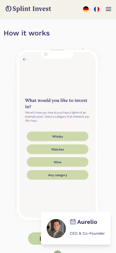
  • Progressive disclosure: "See for yourself" section shows only essential first steps
  • Investment data presented with clear hierarchy: past performance, earning potential
Splint Investment Categories
Clear category organization and simplified choice architecture

Critical Analysis

Strengths
  • Single primary CTA ("Invest now") repeated consistently
  • Clear separation of investment categories without overwhelming options
  • Focused content sections: "How it works" breaks complex process into 4 steps
  • Social proof (testimonials) grouped into digestible cards
  • Want to apear mnimalist and discreet aligning with Old Money way of life and with exclusivity
Areas for Improvement
  • Multiple decisions in the Hero may create decision friction
  • Footer navigation could be better organized into logical groups, with more data
  • Social media links in footer lack visual hierarchy
  • Investment categories lack clear entry points for different expertise levels
  • Performance metrics displayed simultaneously may overwhelm new users
  • Partner logos ("PROUD MEMBER OF") presented without clear relevance hierarchy
  • "About us" and "FAQs" links appear in multiple locations creating redundancy

Recommendations

  • High

    Create progressive disclosure of performance metrics based on user experience level

  • High

    Add smart category filters (price range, risk level, investment term) to reduce initial choices

  • High

    Organize footer links into clear categories (Company, Legal, Support)

  • Medium

    Consolidate navigation links to single locations to reduce decision points

  • Medium

    insisting on the Controlled self-regulation membership : VQF

  • Medium

    Move language choice into a pop-up to reduce header decision load

  • Medium

    Add visual hierarchy to social media links based on user engagement data

  • Medium

    Group partner logos by relevance (Financial, Technology, Certification)

  • Medium

    Move language choice into a pop-up to reduce header decision load

Jakob's Law

Users spend most of their time on other sites. They prefer your site to work the same way as the sites they already know.

Observations

The application follows established investment platform conventions:

  • Consistent top navigation with logo left, menu center, actions right
  • Familiar "Invest now" CTA placement and styling
  • Standard "About us" section with team photos and company story
  • FAQ section using conventional expandable cards
  • Read time indicators similar to Medium and other content platforms
  • Social proof elements (Trustpilot, testimonials) in expected locations
  • Standard footer with company info, links, and social media
  • Familiar grid layout for asset categories and listings
  • Investment metrics displayed similarly to stock trading platforms
Splint Main Interface
Conventional layout following web standards

Critical Analysis

Strengths
  • Clear hierarchy following F-pattern reading conventions
  • Familiar investment card layout with image, title, and metrics
  • Standard iconography for FAQs and features
  • Consistent language selector placement in header
  • Common social media links placement and styling
  • Expected placement of legal information and privacy policy
  • Conventional use of cards for content organization
Areas for Improvement
  • Non-standard asset listing behavior without category filtering
  • Unconventional "Smart Club" concept needs more context
  • Exit process differs from typical investment platforms
  • Lack of standard search functionality for assets

Recommendations

  • High

    Implement standard filtering system for asset categories

  • High

    Add search functionality with expected features like sorting and filtering

  • Medium

    Separate exited assets more clearly from available investments

  • Low

    Add hover states to navigation matching common web patterns

Miller's Law

Human working memory can hold about 7 (±2) items simultaneously.

Observations

The interface presents several cognitive load management challenges:

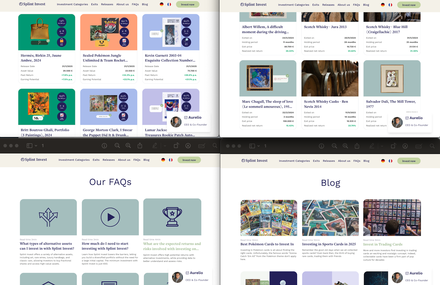
  • Multiple metrics displayed per investment (Exit price, Holding period, Realized net return)
  • Diverse asset categories presented simultaneously (Trading Cards, Sneakers, Sports Memorabilia, etc.)
  • Complex performance data shown in asset listings (p.a. returns, holding periods, comparisons)
  • Multiple navigation options (Categories, Exits, Releases, About us, FAQs, Blog)
  • Various social proof elements (Trustpilot scores, partner logos, user testimonials)
  • Detailed investment parameters for each asset (dates, periods, returns, prices)
  • Multiple language options and CTAs competing for attention
Investment Details Page
Complex information architecture across investment pages

Critical Analysis

Strengths
  • Clear categorization of investment types with visual differentiation
  • Consistent data presentation format across all asset types
  • Visual hierarchy emphasizing key metrics (return percentages in green)
  • Read time indicators helping users manage cognitive load
  • Grid layout organizing assets into digestible chunks
  • Clear separation between active investments and exited assets
  • Use of images to reduce cognitive load in asset recognition
Areas for Improvement
  • Dense numerical data presentation in asset cards
  • Multiple CTAs competing for attention in header area
  • Complex performance metrics shown simultaneously
  • No clear information hierarchy in partner logos section
  • Navigation menu contains more than 7 items
  • Asset descriptions mix technical and marketing information
  • Exit information combines dates, prices, and performance data

Recommendations

  • High

    Implement progressive disclosure for detailed asset metrics

  • High

    Create simplified view option focusing on key metrics only

  • Medium

    Group navigation items into max 5-7 main categories

  • Medium

    Separate technical data from marketing content in asset descriptions

  • Low

    Add toggle for basic/advanced performance metrics display

Tesler's Law

Every system has an irreducible level of complexity. At best, it can only be shifted between the system and its users.

Observations

Splint Invest balances complexity between system and users through:

  • Educational Content Management - Blog articles explaining complex topics (e.g., "How to Spot a Fake Handbag") - Read time indicators helping users manage information load - Investment guides broken into digestible sections
  • Technical Complexity Handling - Expert due diligence process - FINMA supervision and compliance - Automated asset verification - Secure data encryption
  • User Decision Support - Expert picks for emerging artists - Performance trend analysis - Investment opportunity categorization - Smart Club for active investors
  • Process Transparency - Clear fee structure explanation - Documented exit strategies - Asset quality verification process - Legal framework guidelines
Complexity Management
Balance of educational content and system automation

Critical Analysis

Strengths
  • System Handles - Complex legal compliance - Asset authentication - Security measures - Performance tracking
  • User Education Support - Detailed blog content - Investment guides - FAQ categorization - Expert insights
Areas for Improvement
  • Educational Gaps - Limited interactive learning tools - Complex terms without in-context definitions - No personalized learning paths - Scattered information across blog and FAQs
  • System Limitations - Manual portfolio monitoring - Basic search functionality - Limited asset comparison tools - Minimal automation in asset discovery

Recommendations

  • High

    Implement interactive learning modules with practical examples

  • High

    Create a mokup of a portfolio perhaps already in home page

  • Medium

    Develop guided investment tutorials with progress tracking

  • Medium

    Add automated and interactive asset comparison and analysis tools

  • Low

    Integrate contextual help system throughout the platform

Serial Position Effect

Users best remember items at the beginning and end of a list.

Observations

Splint Invest's implementation of serial position effect:

  • Navigation Menu Structure - Investment Categories at top - App Store link at bottom - Core features in middle
  • Investment Category Placement - Whisky prominently first - "Any category" option last - Popular categories in prime positions
  • Homepage Content Organization - Key value proposition at start ("Diversify your portfolio") - App store ratings at top (4.4 and 4.8 stars) - "Made in Switzerland" certification at bottom
  • Performance Metrics Display - Annual return percentage prominent - Comparison data with S&P 500 at end - Technical details in middle
Menu Organization
Strategic placement of key information

Critical Analysis

Strengths
  • Clear primary action at top ("Invest now" button)
  • Important features positioned first in mobile menu
  • Key benefits highlighted at start of sections
  • Trust indicators placed strategically at end points
  • Return metrics positioned for maximum recall
  • Main navigation prioritizes key investment actions
  • Critical app features emphasized in prime positions
Areas for Improvement
  • Key performance data sometimes buried in middle sections
  • Important investment options lost in category lists could be clearer on hero section
  • Critical information mixed with secondary details in FAQs
  • "How it works" steps may lack emphasis except color on key points
  • Mobile menu mixes primary and secondary items
  • Blog content structure buries important insights: perhaps adding the date

Recommendations

  • High

    Restructure mobile navigation to prioritize investment actions

  • High

    Move high-performing investment options to start of category lists

  • Medium

    Reorganize FAQ sections with most important items at top/bottom

  • Medium

    Highlight key performance metrics at start and end of each asset card if available

  • Low

    Add featured content sections at start/end of blog listings

Zeigarnik Effect

People better remember uncompleted tasks than completed ones.

Observations

Splint Invest's implementation of incomplete states:

  • Content Engagement - Read time indicators (4min, 5min, 7min) creating time commitment awareness - Paginated asset lists showing "Next" options - Truncated descriptions encouraging further reading
  • Investment Journey - Clear category selection steps - Visible investment progress tracking - Multiple asset category tabs (Whisky, Wine, Watches) suggesting exploration
  • User Progress - Portfolio diversification suggestions - Investment comparison tools showing potential - Growth tracking with clear target metrics
  • App Navigation - Menu items suggesting available sections - Numbered steps in "How it works" - Pagination indicators showing more content
Progress Tracking
Investment progress and completion states

Critical Analysis

Strengths
  • Clear investment category progression
  • Visual progress indicators in asset browsing
  • Step-by-step investment process visibility
  • Transparent reading time commitments
  • Multiple entry points for different interests
  • Clear navigation breadcrumbs
Areas for Improvement
  • No visual progress in category exploration
  • Limited investment goal tracking
  • No personalized achievement system
  • Lack of saved investment preferences

Recommendations

  • High

    Add portfolio diversification progress tracker

  • High

    Implement investment goal completion system

  • Medium

    Create category exploration progress indicators

  • Medium

    Add watchlist and research tracking features

  • Low

    Develop achievement system for investment milestones

Von Restorff Effect

Distinctive items are more likely to be remembered than those blending in.

Observations

Visual distinction implementation:

  • Performance Metrics - Green color for positive returns (64.68%, 32.10%, 15.42%) - Large typography for significant figures (574.500 €) - Prominent placement of holding periods
  • Asset Presentation - Distinct background colors per category (blue, yellow, mint) - High-quality artwork images - Brand logos (Artemundo) for authentication
  • Exit Information - Structured date format highlighting - Clear separation of financial metrics - Distinguished realized returns
  • Visual Hierarchy - Premium artwork prominent placement - Notable collections emphasized (Dalí, Chagall) - Distinctive investment categories
Distinctive Elements
Visual distinction in exited assets display

Critical Analysis

Strengths
  • Clear color-coding of performance metrics
  • Effective use of whitespace for important data
  • Strong visual hierarchy in asset cards
  • Distinct categorization of investment types
  • High-impact presentation of key artworks
  • Consistent formatting of financial data
Areas for Improvement
  • Uniform treatment of exit dates regardless of proximity
  • Similar visual weight for different value ranges
  • Limited highlighting of exceptional returns
  • No visual distinction for premium collectibles
  • Consistent card format regardless of asset significance
  • Minimal emphasis on unique investment features

Recommendations

  • High

    Implement visual highlighting for exceptional returns (>50%)

  • High

    Add premium badges for high-value assets (>100,000€)

  • Medium

    Design distinct card layouts for different asset categories

  • Medium

    Introduce visual urgency indicators for near-term exits

  • Low

    Create special visual treatments for limited editions

Selective Attention

Users focus on elements relevant to their current task.

Observations

Focus management in investment flows:

  • Critical metrics highlighted with bold typography and color (ROI, Asset Value)
  • Key investment data in purple badges (Return rates, Investment horizon)
  • Asset details structured in clear sections (Description, Expert Analysis, Documents)
  • Visual hierarchy using distinct color blocks per asset category
  • Clear separation between financial details and contextual information
  • Authentication badges positioned near relevant content (provider/asset manager/holder)
Complexity Management
Balance of educational content and system automation

Critical Analysis

Strengths
  • Consistent placement of key metrics across all assets
  • Clear visual separation between different information types
  • Effective use of color coding for categories
  • Progressive disclosure in asset details
Areas for Improvement
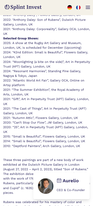
  • Dense artist biography sections could overwhelm
  • Complex valuation details not clearly separated
  • Investment horizon information could be more prominent

Recommendations

  • High

    Implement collapsible sections for detailed information

Working Memory

Limited working memory capacity influences how users process information.

Observations

Information chunking and memory support:

  • Investment metrics grouped in sets of 3-4 key data points
  • Artist information structured in clear biographical timeline
  • Investment rationale broken into distinct sections
  • Documentation organized in clear categories (Factsheet, Consumer Information)
  • Exit strategies presented in logical progression
Complexity Management
Balance of educational content and system automation

Critical Analysis

Strengths
  • Clear categorization of complex information
  • Consistent information architecture across assets
  • Visual aids supporting numerical data
  • Logical grouping of related information
Areas for Improvement
  • Exhibition history could be better structured
  • Technical details mixed with marketing content
  • Risk information needs clearer presentation
  • Investment timeline could be more visual

Recommendations

  • High

    Create visual timeline for artist exhibition history

  • Medium

    Separate technical specifications from marketing content

Global Synthesis

Splint Invest's platform effectively balances investment complexity with user experience.

Major Strengths

  • Excellent visual hierarchy for investment metrics
  • Clear categorization and structure of complex assets
  • Effective use of color and typography for focus
  • Strong balance of technical and contextual information

Priority Improvement Areas

  • Enhanced visual presentation of timelines and history
  • Clearer separation of technical and marketing information
  • Improved risk and investment horizon visibility

UX Analysis: Timeless

timeless.investments

Luxury watch and collectibles investment platform

Watches Alternative Assets

UX Analysis: Konvi

konvi.app

Luxury watch and collectibles investment platform

Watches Luxury

UX Analysis: Masterworks

masterworks.com

Art investment platform offering fractional ownership in fine art masterpieces

Art Investment Fine Art

UX Analysis: Public.com

public.com

Social investment platform offering stocks, ETFs, crypto, and alternative assets with community features

Investing Social Trading

UX Analysis: Delen Private Bank

delen.bank

Private banking and wealth management

Private Banking Wealth Management

UX Analysis: Rothschild Private Bank

rothschildandco.com

Global private banking, asset management, and financial advisory

Private Banking Asset Management Advisory

UX Analysis: Pictet Private Bank

pictet.com

Wealth management, asset management and related services

Wealth Management Asset Management

UX Analysis: UBS Wealth Management

ubs.com

Global wealth management and investment banking

Wealth Management Investment Banking

UX Analysis: Lombard Odier

lombardodier.com

Private banking, institutional asset management and family office services

Private Banking Family Office

UX Analysis: BlackRock

blackrock.com

Global investment management and technology solutions

Asset Management Technology

UX Analysis: Vanguard

vanguard.com

Investment management company offering mutual funds and ETFs

Mutual Funds ETFs

UX Analysis: JP Morgan Chase

jpmorgan.com

Global banking, investment banking, and wealth management services

Banking Investment Banking Wealth Management

UX Analysis: HSBC Private Bank

privatebanking.hsbc.com

Global private banking and wealth management solutions

Private Banking Wealth Management Global Banking

UX Analysis: Merrill Lynch

ml.com

Wealth management, financial advisory, and investment services

Wealth Management Financial Advisory Investment Services

Design Inspiration

This interactive guide draws its unique visual style from the revolutionary work of

Jackson Pollock

The dynamic paint splatters and drips you see across this page pay homage to Pollock's iconic "drip painting" technique, where he would:

  • 01 Layer colors spontaneously
  • 02 Create organic, flowing movements
  • 03 Build depth through random patterns
"The painting has a life of its own. I try to let it come through." - Jackson Pollock
Interactive Paint Area

Move your mouse to create your own Pollock-inspired artwork

Interested in collaboration?

I'm always open to discussing new projects and creative ideas.